The key to an iconic artist photo isn’t a better camera or a cooler pose; it’s the deliberate act of translating your sonic identity into a coherent visual language.
- Generic photos document appearance; iconic photos construct a myth and tell a story that resonates with an audience.
- Authenticity isn’t found, it’s engineered through a deep understanding of your own artistic narrative and how to express it visually.
Recommendation: Stop trying to look like a musician. Instead, build a visual world that *sounds* like your music, starting with the core message you want to convey.
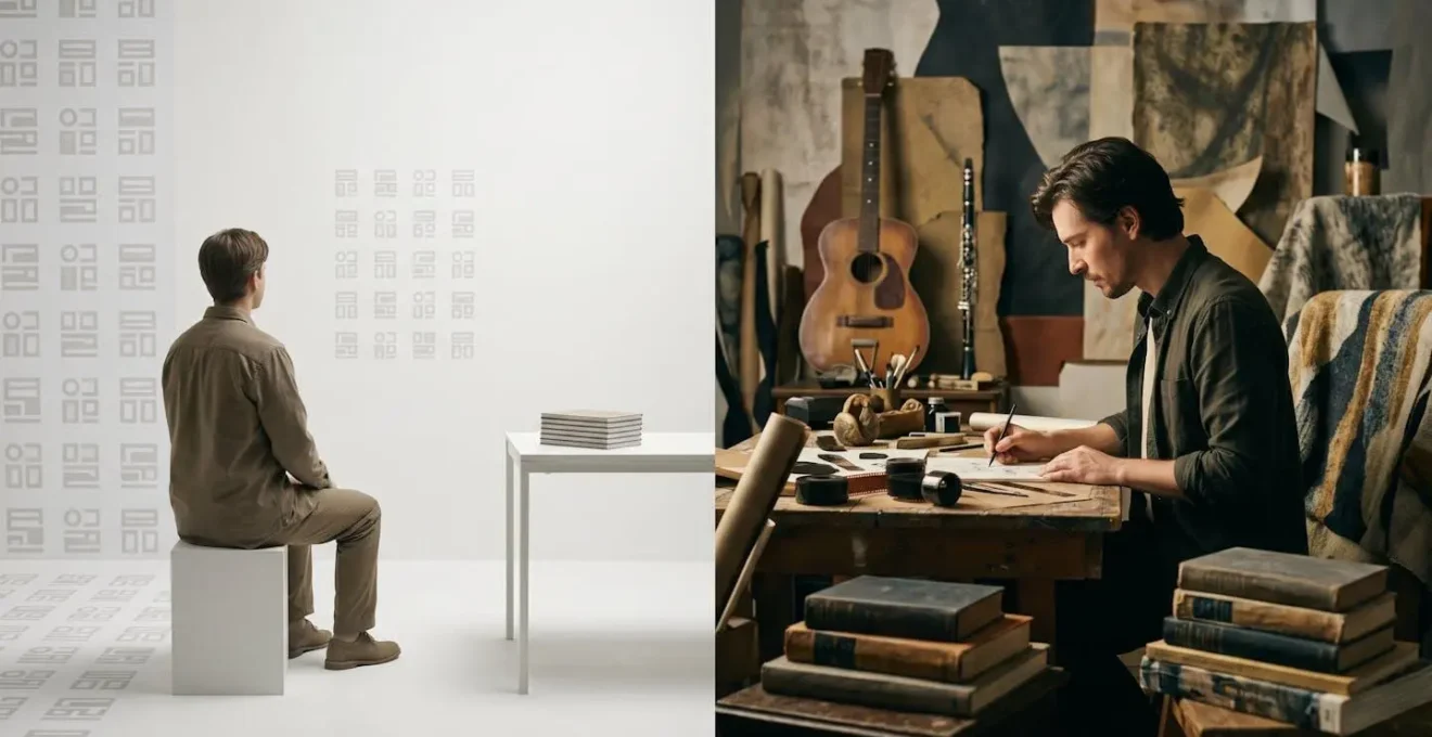
You’ve seen them a thousand times. The musician leaning against a brick wall, arms crossed. The band staring blankly from a white studio background. The singer-songwriter gazing thoughtfully into the middle distance. These images are technically competent, professionally lit, and utterly forgettable. They are ghosts in the vast machine of music promotion, failing to capture the one thing that matters: the unique sonic world of the artist. The common advice is to « be authentic » or « tell a story, » but these are empty platitudes without a practical framework. They don’t explain why some images become synonymous with an entire genre or era, while others are scrolled past without a second thought.
The problem is a fundamental misunderstanding of the medium. We’ve been taught to think of photography as a tool for documentation—capturing what is there. But iconic artist photography is not about documentation. It is about visual myth-making. It’s an act of translation, converting the intangible feelings, textures, and narratives of your music into a tangible visual language. This is where most artists and photographers fail; they focus on capturing a likeness, not an essence. They aim for a ‘cool’ picture instead of a meaningful one.
This guide reframes the entire process. We will move beyond the superficial and dive into the semiotics of a powerful image. We’ll explore why a sterile background is a wasted opportunity and how to build a narrative with your environment. We’ll deconstruct the psychology of getting a genuine expression, choose a visual style that serves your sound, and dismantle the poses that make everyone look the same. By understanding how an icon like Madonna used visuals to define her career, you’ll learn that the secret to an unforgettable photo lies not in what the camera sees, but in the story you intentionally decide to tell.
This article provides a structured approach to move your visual identity from generic to iconic. The following sections break down the essential components of creating compelling and memorable artist photography.
Table of Contents: Why a Compelling Visual Identity is Essential for Musicians
- Why Does a Plain White Background Waste Your Chance to Tell Your Story?
- How to Get Natural Expressions from Artists Who Freeze During Photo Shoots?
- Moody Black and White or Vibrant Colour: Which Style Serves Your Music Best?
- The 5 Overused Poses That Make Every Musician Look the Same
- How Often Should You Update Your Artist Photos Without Confusing Your Audience?
- How Did Madonna Stay Relevant for 40 Years While Her 80s Peers Disappeared?
- Support Slot, Headline Tour or Festival Circuit: Which Builds Your Career Faster?
- Why Does Touring Destroy Musicians’ Health Even When the Shows Go Well?
Why Does a Plain White Background Waste Your Chance to Tell Your Story?
A plain white background is the visual equivalent of silence. In a world saturated with imagery, it says nothing. It strips you of context, personality, and narrative, reducing you to a mere object for observation. The fundamental mistake is viewing the background as a neutral space. In photography, there is no such thing as neutral; every element within the frame either adds to your story or detracts from it. A blank void actively detracts by creating a visual vacuum, forcing the viewer to focus solely on your physical appearance rather than your artistic essence. This is a massive squandered opportunity for visual storytelling.
Your environment is your co-star. It’s a powerful tool for communicating genre, mood, and ethos without a single word. A cluttered, sun-drenched bedroom suggests intimacy and a DIY folk aesthetic. A stark, brutalist concrete structure can evoke feelings of industrial music, alienation, or minimalist electronica. As one branding guide notes, the goal of professional photography is to tell a story not just of you, but of your art and culture. The background is the first chapter of that story. Using a blank one is like tearing out the first page of a novel. You’re asking the audience to connect with a character they know nothing about.
Even minimalism can be narrative. Look at the collaboration between Madonna and photographer Steven Klein for the X-STaTIC PRO=CeSS installation. They used stark, surreal, and often minimalist settings not as a neutral backdrop, but as an active element to deconstruct her public persona. The emptiness was charged with psychological tension and conceptual meaning. The lesson is clear: your background shouldn’t just be a place where the photo is taken. It should be an intentional choice that reflects the sonic landscape of your music. Ask yourself: if my album was a room, what would it look like? Start there, and you’ll never settle for a plain white wall again.
How to Get Natural Expressions from Artists Who Freeze During Photo Shoots?
The moment a camera is pointed at someone, they become acutely self-aware. The natural, un-guarded person disappears, replaced by a stiff, performed version of themselves. This is the primary challenge in portraiture, especially with artists who aren’t trained models. The typical photographer’s response is to give more direction: « Look here, » « Smile, » « Try to look intense. » This almost always makes it worse, leading to expressions that feel forced and inauthentic. The key to capturing a natural expression is to stop directing a performance and start fostering a genuine connection.
A great portrait is a collaboration built on trust. As Portland-based photographer Morgan Eldridge states, getting to know the artist is a crucial part of the process. In my experience, the first 30 minutes of a shoot should involve as little shooting as possible. It’s about conversation, listening to their music, and understanding their perspective. The goal is to make the camera’s presence incidental to the human interaction. You’re not just taking a picture; you’re creating a space where the artist feels safe enough to be themselves. This approach transforms the session from a performance into a shared experience, and the resulting expressions reflect that.
Getting to know you is crucial to my process. Great portraiture is born of a personality and unique storytelling.
– Morgan Eldridge, Mewphotovideo
The most powerful moments often happen between the planned shots. The thoughtful gaze away from the camera, the deep breath before a take, the way their hands naturally rest on their instrument—these are the moments of engineered authenticity. Your job as the photographer is to be ready for them. Give the artist an action to perform rather than a pose to hold. Ask them to tune their guitar, write down a lyric, or simply walk across the room. By focusing their attention on a familiar task, their self-consciousness dissolves, and their true character emerges.
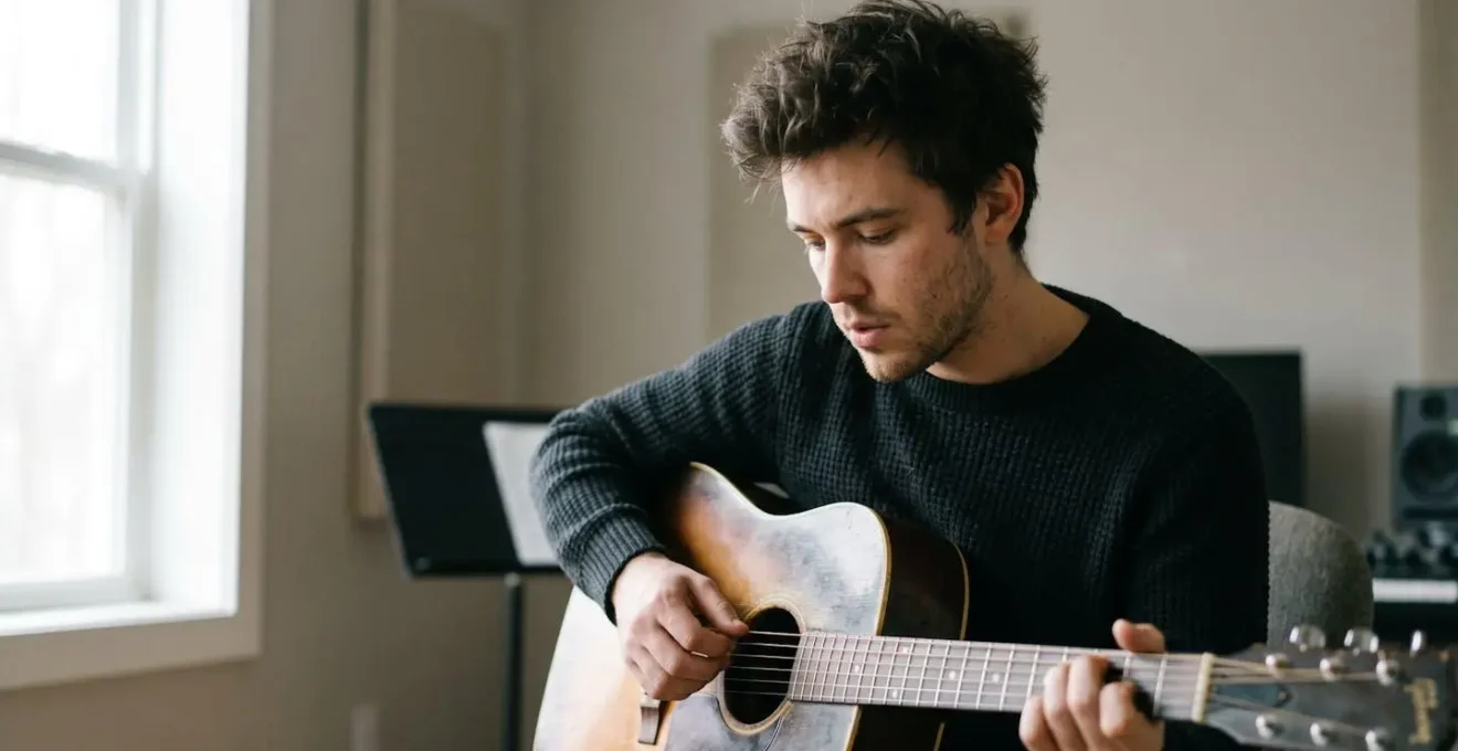
The image above captures exactly this principle. It is not a pose; it is a moment of introspection caught between instructions. This is where vulnerability and authenticity live. Forget the perfect smile; search for the quiet, unguarded truth. It’s in these « in-between » spaces that a good portrait becomes an iconic one.
Moody Black and White or Vibrant Colour: Which Style Serves Your Music Best?
The choice between black and white and colour is one of the most fundamental decisions in building your visual vocabulary, yet it’s often made arbitrarily. This isn’t just an aesthetic filter; it’s a powerful act of sonic-to-visual translation. Each style carries its own set of cultural and emotional connotations, and your choice should be a deliberate reflection of your music’s core identity. To choose correctly, you must first decode the language of each.
Black and white photography strips away information, forcing the viewer to focus on form, texture, light, and emotion. It inherently feels more timeless and classic. Think of the iconic portraits of jazz legends or the raw, gritty energy of early punk rock photography. B&W excels at conveying:
- Timelessness and Nostalgia: It removes the image from a specific, contemporary time period.
- Raw Emotion: Without the distraction of colour, subtle shifts in expression and mood become more pronounced.
- Documentary Realism: It has a long history associated with photojournalism, lending a sense of truth and authenticity.
If your music is raw, acoustic, introspective, or rooted in a classic genre, black and white can be a powerful way to align your visual and sonic identity.
Colour, on the other hand, is visceral and immediate. It operates on a more direct emotional and psychological level. The specific palette you choose can define your genre and era instantly. A highly saturated, vibrant palette screams pop, funk, or psychedelia. Desaturated, earthy tones might suggest folk, ambient, or Americana. Vibrant colour is effective for:
- Energy and Dynamism: Bright colours convey excitement, youth, and movement. Think of the hyper-colourful world of pop artists.
- Genre Signalling: Specific colour combinations become shortcuts for genres (e.g., the neon-noir palette of synthwave).
- Emotional Mood Setting: A warm, golden-hour palette creates a feeling of warmth and intimacy, while a cold, blue-toned palette can suggest melancholy or isolation.
The decision isn’t about which is « better. » It’s about which is more truthful to your sound. Close your eyes and listen to your most definitive track. What colours, or lack thereof, do you see? Is the feeling raw and elemental, or is it a carefully constructed world of specific hues? The answer to that question is the answer to this one.
The 5 Overused Poses That Make Every Musician Look the Same
Poses are the enemy of authenticity. A pose is, by definition, an unnatural position held for the purpose of being photographed. It is a performance of what someone *thinks* a musician should look like, rather than an expression of who they are. This is why so many artist photos feel interchangeable; they are all drawing from the same shallow well of visual clichés. To create something memorable, you must first identify and reject these tired tropes.
Here are the five most overused poses that instantly signal a lack of originality:
- The Tough-Guy Lean: Arms crossed, leaning against a wall (usually brick). It’s an attempt to look serious and defiant but comes across as defensive and deeply generic.
- The Middle-Distance Stare: Gazing thoughtfully off-camera at an imaginary point of inspiration. It’s meant to convey deep artistry but often just looks vacant.
- The « Look at My Instrument » Prop: Holding a guitar or bass like a shield or a weapon. The instrument becomes a prop that defines them, rather than an extension of their creativity.
- The Forced Laughter Group Shot: The entire band caught in a moment of apparently spontaneous, simultaneous hilarity. It rarely looks genuine and feels like a stock photo.
- The « Crouching on the Pavement » Urban Poet: A low-angle shot of the artist crouching on a gritty city street, meant to signal « realness » and an urban edge. It’s become a parody of itself.
These poses are clichés because they are disconnected from genuine emotion and action. They are empty gestures. The alternative is not to invent a new, crazier pose. The alternative is to replace posing with doing.
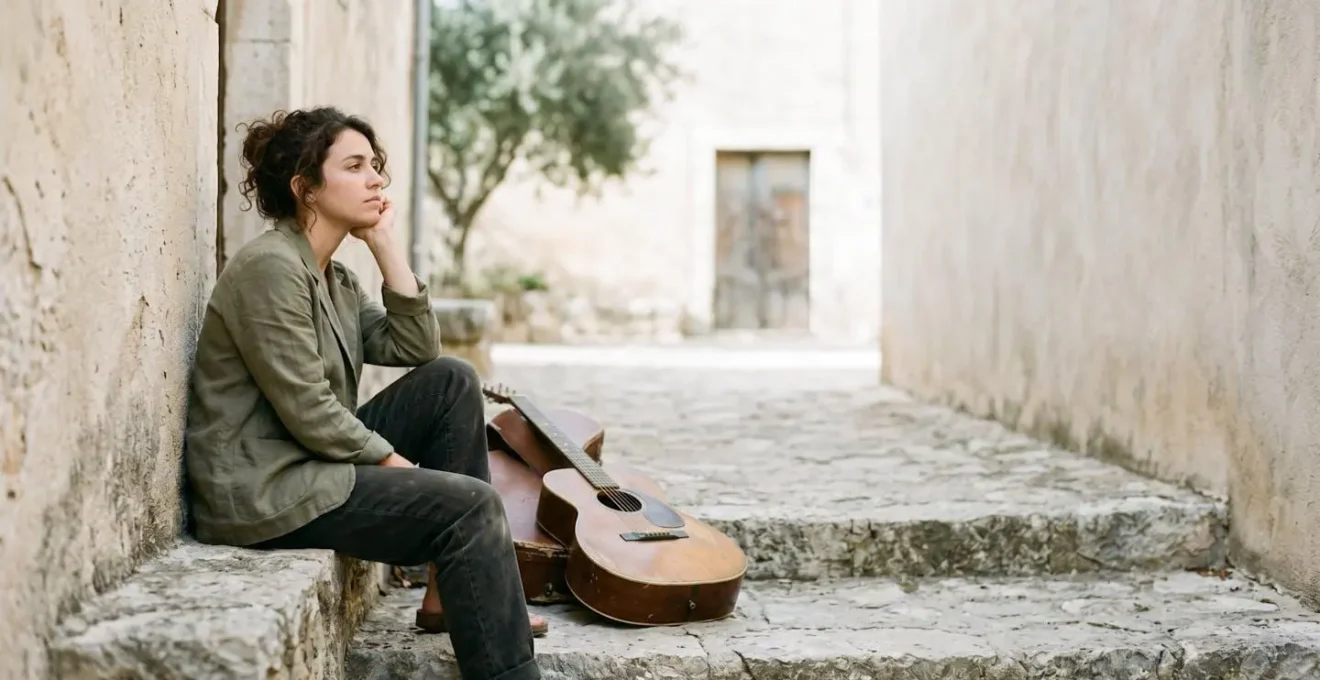
Instead of asking an artist to *look* thoughtful, ask them to write down a lyric. Instead of having them *hold* their guitar, have them tune it. Let them interact with their environment in a way that feels natural to them. The resulting body language will be infinitely more compelling and authentic because it is rooted in a real action, not a contrived performance. The image above works because the artist is engaged with their space, not with the camera. Their posture is a result of their contemplative mood, not a photographer’s instruction.
Action Plan: Auditing Your Visual Story
- Keywords & Mood: List five distinct words that describe your music’s core sound and emotional feeling (e.g., « warm, » « chaotic, » « wistful »).
- Reference Audit: Collect three to five images—not of other musicians—that evoke this mood. This could be a landscape, a piece of architecture, or an abstract texture.
- Environmental Scan: Identify three real locations from your daily life (your bedroom, a local park, a rehearsal space) that feel authentically connected to you and your creative process.
- Wardrobe Story: Select one complete outfit that feels like « you » on your most creative day, not a costume you think a musician would wear.
- Action/Interaction Plan: Define one simple, natural action you can perform during the shoot (e.g., drinking coffee, reading a specific book, adjusting an amp) to anchor you in a real moment.
How Often Should You Update Your Artist Photos Without Confusing Your Audience?
The question of when to update your artist photos is a strategic one, tied directly to the narrative arc of your career. Too frequent, and you risk a fragmented, confusing identity. Too infrequent, and your visuals become stale, no longer representing the artist you are today. The answer isn’t a fixed timeline, but a rhythm dictated by your creative output. The most effective model is to align your visual updates with your album or project cycle.
Think of each album, EP, or major single as a distinct « era. » Each era has its own sound, theme, and emotional core. Your promotional photos are the visual signifier of that era. When you release new music, you should release new photos that reflect its sonic and thematic shift. This creates a cohesive, immersive experience for your audience. They learn to associate a specific look with a specific sound, strengthening the identity of that body of work. This is the foundation of building a strong visual brand; it’s about consistency *within* an era, and deliberate evolution *between* eras.
We are ever-evolving as artists, and so our images should evolve, too.
– Titilayo Ayangade, I CARE IF YOU LISTEN
Updating your photos for every new project doesn’t confuse your audience; it guides them. It signals that something new is happening. It tells them, « This is the world of the new record. This is what it looks like. » Conversely, using three-year-old photos to promote a new album creates a disconnect. It suggests you haven’t fully committed to the new identity or, worse, that you don’t have one. Your visual presence should always be an accurate reflection of your current artistic self. Don’t be afraid to shed your old skin. That evolution is a crucial part of your story.
How Did Madonna Stay Relevant for 40 Years While Her 80s Peers Disappeared?
While many of her 80s contemporaries became nostalgia acts, forever trapped by the sound and style of their initial success, Madonna achieved unprecedented longevity. The reason is simple and profound: she understood that her primary product was not just music, but continual reinvention. While others were defined by a single visual identity, Madonna treated her identity as a fluid, evolving canvas. She mastered the art of visual myth-making, ensuring the world was always wondering what she would do next.
Her strategy was built on the album cycle as a vehicle for complete transformation. Each new record wasn’t just a collection of songs; it was the debut of a new Madonna, complete with a meticulously crafted aesthetic, thematic narrative, and visual vocabulary. This principle of constant change became her only constant, allowing her to stay at the forefront of cultural conversation for decades. She was never just a pop star; she was a cultural phenomenon in perpetual motion.

This abstract image, with its layers of texture and material, symbolises the very essence of Madonna’s strategy: a constant, tactile metamorphosis. Her career is a masterclass in this process, demonstrating how to build a lasting legacy through strategic change.
Case Study: Madonna’s Album Cycle Visual Strategy
Madonna’s career is a series of distinct visual chapters. The street-savvy, pop-punk look of Like a Virgin (1984) was a world away from the spiritual, ethereal electronica of Ray of Light (1998), which in turn was completely different from the urban-equestrian chic of American Life (2003). As documented in an analysis of her branding strategy, each album presented a new visual era to the world. Her performance of « Like a Virgin » in a wedding dress at the 1984 MTV Video Music Awards was not just a performance; it was a culture-defining statement that became one of the most iconic moments in pop history. She understood that a powerful visual could be more resonant than the song itself.
The lesson for any artist is clear: relevance is not maintained by clinging to what worked once. It is achieved by having the courage to evolve and signaling that evolution through a powerful and ever-changing visual identity. Your audience doesn’t just want to hear your growth; they want to see it.
Support Slot, Headline Tour or Festival Circuit: Which Builds Your Career Faster?
This question is often framed as a simple career ladder, but when viewed through the lens of building a visual identity, each stage offers a unique and crucial opportunity. The type of touring you do directly impacts your photographic needs and the kind of visual story you can tell. Your visual strategy should adapt to each stage, maximising its potential to build your brand. Data from the live music sector reveals that artists themselves are the largest clients for photographers, which underscores the need for a proactive visual strategy at every level.
The Support Slot: Capturing Raw Energy. When you’re the opening act, you have a captive, but often unfamiliar, audience. Your goal is to make an impression, fast. The photography here is about capturing raw, high-energy moments. These are the images for social media, designed to convey the excitement of your live show to people who weren’t there. The lighting may be poor and the stage small, but these constraints can be used to create gritty, intimate, and authentic-feeling shots. The focus is on impact and immediacy.
The Headline Tour: Crafting the Iconic Image. As a headliner, you have control over the stage, the lighting, and the narrative of the show. This is your opportunity to create polished, iconic live photographs for your press kit, website, and official merchandise. The photography should be more considered, capturing not just energy but also the carefully crafted moments of the show. This is where you work with a trusted photographer to create the definitive images that will represent this era of your career. The focus is on quality and narrative control.
The Festival Circuit: Showing Scale and Connection. Festivals place you in front of the largest audiences. The visual goal here is to show scale. Wide shots that capture you on a massive stage in front of a sprawling crowd are incredibly powerful social proof. These images demonstrate your reach and your ability to connect with a large audience. They are less about intimate details and more about conveying the scope and magnitude of your project. Each stage builds on the last, creating a rich and diverse portfolio of live imagery that tells the story of your growing career.
Key Takeaways
- An iconic photo tells a story; its environment and style are deliberate choices that translate your music into a visual language.
- Authentic expression comes from connection and action, not from holding a pose. Replace performance with purpose.
- Visual identity must evolve with your music. Align new photos with new project cycles to guide your audience through your artistic journey.
Why Does Touring Destroy Musicians’ Health Even When the Shows Go Well?
Even when a tour is a resounding success—sold-out shows, ecstatic crowds, positive reviews—it can be a deeply corrosive experience for an artist’s physical and mental health. The core issue is the fundamental conflict between the demands of the road and the basic needs of the human body. The constant travel, lack of routine, poor sleep, and immense pressure create a perfect storm for burnout, even when the career itself is thriving. This isn’t a sign of weakness; it’s a predictable outcome of an unsustainable lifestyle.
The adrenaline of a 90-minute performance can mask deep-seated exhaustion, but it doesn’t negate it. As the Musician Therapy Collective points out, « Long hours, poor sleep, and constant pressure can wear you down fast. » The body is kept in a perpetual state of ‘fight or flight’, leading to a depleted nervous system. This constant state of high alert is compounded by inconsistent nutrition, isolation from loved ones, and the psychological whiplash of moving from the roar of a crowd to the silence of a hotel room night after night. Signs of this burnout can include feeling emotionally numb, highly irritable, or simply being in a state of profound exhaustion.
From a creative and visual perspective, this is a critical issue. The raw material for an iconic photograph is the artist’s own energy and presence. A musician suffering from burnout cannot project the charisma, vulnerability, or power that a great photo requires. Their eyes will look tired, their posture will be deflated, and their expression will be a mask of endurance rather than a window to their soul. No amount of good lighting or clever direction can manufacture an energy that simply isn’t there. The health of the artist is the unseen foundation of a powerful image. Protecting it is not a luxury; it is an essential part of maintaining a compelling visual identity.
Your next step is to stop thinking about what a musician photo *should* look like, and start defining what your music *does* look like. Begin by auditing your visual story today, because a truly iconic image is not just seen—it’s felt.